
1. The project
Overview:
When starting any project, my initial step involves engaging directly with experts (or those responsible for the content). This involves not only understanding their primary concepts but also immersing myself in their detailed documents to get a comprehensive understanding of the subject.
Even if you're an expert watching this, verbalizing your expertise to someone unfamiliar can offer a fresh perspective, making this process invaluable.
So we’re going to look at the draft copy we’ve been given to start with. I spoke with academic Dr Brendan Lawson of Loughborough University about his research project and thought it would be a great project to use as an example of how my process works.
I’ve asked him to put together some initial copy for a poster about his research. This is very much an overview of his project so that I will be approaching the information from a top level perspective.
To kick us off I’m going to look at the information in the poster from several different perspectives. Before diving into the design work of the final poster, I’m going to play around with ways in which different information inside the poster could be presented, creating some mini infographics along the way. We won't use all of these approaches in our final poster, but it will hopefully be useful as a means to explore and communicate research information in general. It’s always good to try a few approaches before looking at the bigger picture.

Note:
When creating graphics or visualising concepts, early insights and feedback from experts enhances my understanding and provides initial direction. If a topic feels challenging, it's an indicator others might find it similar. Therefore, testing graphics with those less familiar is super important. The perspective of 'fresh eyes' is invaluable, but it fades quickly.
To optimise clarity and engagement, I constantly seek fresh pairs of eyes, gauging understanding based on my own comprehension challenges.
The source document: examining categories and hierachy
I’ve had a read through the document once already just so I can get a feel for it. You can see a screenshot below. This is the poster content we will be working with.

Dr. Lawson's research delves into the burgeoning realm of 'climate apps', tools designed for citizens to actively participate in climate action. While platforms like Alipay's Ant Forest have achieved massive user bases, there's a glaring research gap, especially outside of China, about their efficacy and trustworthiness. The crux of Dr. Lawson's study questions the reliability and accuracy of claims made by these apps. This discrepancy in trustworthiness can lead to misconceptions, paving the way for potential misinformation and false claims. To address this, Dr. Lawson aims to devise a set of "trust indicators", providing users with a clear benchmark to gauge the authenticity and impact of these apps. As we design our infographic, it's crucial to encapsulate the research's essence, structure, and overarching concerns presented in the document.
Information architecture
First let's think of the ‘information architecture’ and the hierarchy of content that is within our poster. I’m going to do this through the lens of a tree diagram. This will just help us look at the content of the poster, its main branches of information, and the levels of hierarchy. As we’re talking about trees I thought it would have felt wrong not to use this as a starting point!

Tree diagram
Tree diagrams allow us to add different levels of visual categorisation to demonstrate how we can think and visually organise our content at a higher level.
Here’s a basic outline of the poster content, using nodes. We’ve got the structure of the project outlined well here, with the hierarchy being clear.
The poster will cover the main sections:
Expected findings
Research Questions
Methods
Theory
Context
There are different levels of visual encoding we can use to make this structure clearer. This isn't our final format, but rather a way to look at how we can represent our information categories.
How this was made: For those interested, I asked ChatGPT to code a tree diagram in D3JS. with the information provided. This came out in a javascript, CSS and HTML format which I used to produce the tree diagram. I then copied this into Adobe Illustrator to manipulate the individual elements.
Encoding
So now we’ve got our basic structure, you can see the top level of category, and the content within them within the secondary nodes.
So let’s add some encoding. We’ll add numbers and letters for to enhance the categorisation. We’re all familiar with this encoding approach.
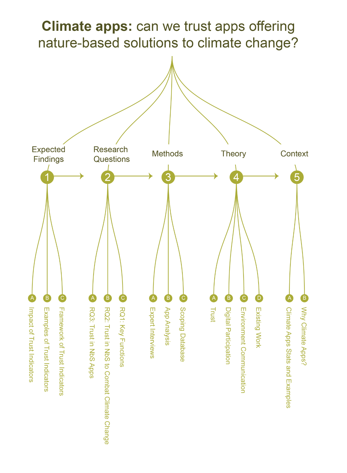
Adding shapes
Now to make the sections even more recognisiable, let’s use shapes to determine each section. It’s only necessary to use one encoding device but I think it helps to strengthen the identity to use multiple approaches.
If we were stretching this encoding out across a longer document like a report or guide, we'd be able to use these as universal symbols to represent and refer back to each section.


Adding color
Now watch as we add colors for each section as well.
What we now have is an information and encoding structure that works. We can think of any of these elements as interchangeable, for example the shapes could change to illustrations or icons.
Encoding with Google Sheets
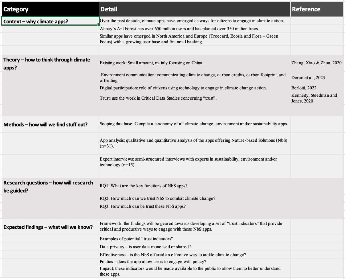
If a tree diagram isn't within your skillset or doesn't appear, we can do this with spreadsheets. Simply add columns for categories. We can actually do quite a lot within these too.
If you’re a Google sheets user, you can upload images into cells, so you could even add the symbols too!

Adding color
Watch what happens when we add color, numbers, and letters to the spreadsheet. Basic stuff but immediately makes it a more palatable experience when absorbing the information.