
Visualising new year’s resolutions
Using interactive visuals to facilitate discussion

Introduction
New Year’s resolutions can be overwhelming to consider and many don’t make them at all. I was interested in producing an interactive visualisation that explores the resolutions people set themselves, and the challenges that came with them.
This approach could be used in visualising responses to any question posed by a group or organisation. I’m sharing my design process from idea to production, highlighting materials and methods used throughout.

The space
The space I had to work with was in the social area of my coworking space. This is also the same place where I hold weekly discussions at Union Street Coworking Space, so it would be the perfect location for the piece. The tall thin dimensions of the space immediately made me think that using the Y axis as a predominant measure of the graphic.
The image shows a long thin wall in a coworking space with foam boards attached to it.

The canvas material
Because of the dimensions, I decided to use foam board, as it was white, and light and also allowed us to pin things on. Combining foam board panels was a cheaper and easier approach to fixing the base of the canvas. I used Command Strips to fix the boards to the wall, stacking them on top of each other.
Adhesive strips attached to a foam board.

The design
Using a mountain-range as a visual metaphor to measure difficulty, I established that the higher up the mountain your new year’s resolution was placed, the harder the resolution would be.
To get the effect of the mountain, and how the visualisations would look, I first mocked up the design on Adobe Illustrator using the dimensions I’d established from the boards in the space. This created a very tall thin mountain. You could use any design software to do this, but the main thing is considering how the visuals could work with the space you’ve got to work with. By mocking up several ideas digitally — it gives you a chance to experiment with ideas before you make the real thing.
A design mockup of the mountain design, visualising the difficulty of new year’s resolutions.
I knew this would be tricky to print, so decided that a mix of colored wrapping paper and colored paper would work well to illustrate the mountain scene. I used a spray mount to fix the wrapping paper to the board while holding the paper in place with pins ( as it’s prone to curling up as soon as you let it go).

Now I had fixed the mountain shapes to the foam board, it was time to add an axis and title to the design so it was easy to understand on viewing without context. For these, I printed out the elements and stuck them onto the design with a spray mount.
This included the axis indicating easier or harder and title title itself.
The cards
I wanted to use cards that could be turned over (one side showing the resolution itself, and the other showing the main challenges faced in achieving the resolution) Post-it notes were not a good option as they are designed for use on one side only. I used pins and a hole punch which would let people interact with the cards once the resolutions had been added.
Process photo illustrates how the hole punch and pin design allows participants to easily look on the other side of the colored cards.
The size of the cards proved quite large in practice, therefore if doing it again, I would make these slightly smaller as the finished piece is quite card-heavy. There was also a gathering are cards within the medium-difficulty part of the design, and was starting to feel like more people would have wanted to post their cards there.
The other interesting thing was that people chose to pin their resolutions onto the mountain itself, not using the sky — which I had not considered would happen.
Making the cards
To make the cards, I sourced some nice colored paper and folded each piece into 8 to define the size of the cards, then cut along the fold
A piece of card folded into eight ready for cutting.

Presenting the cards
During the discussion, the cards were set onto the table beside the key so that people could help themselves to the cards.
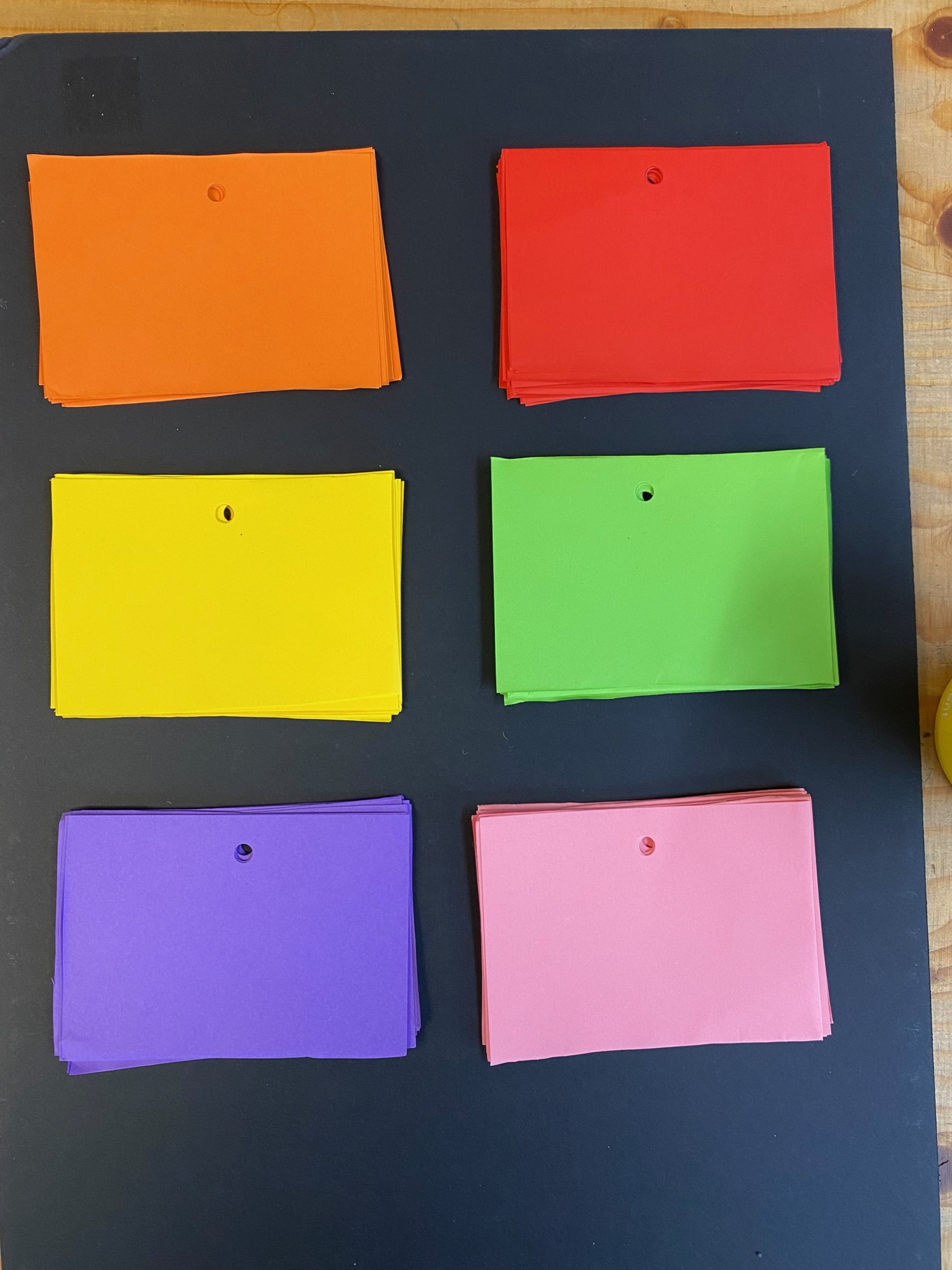
Pieces of colored cards on blackboard, ready for participants to use.
This was positioned next to a printout of instructions. As people were coming in and out of the discussion, it was important to have instructions on a piece of paper that quickly communicated the concept of the design without distracting from the main discussion.
How to add your new year’s resolution. 1 Pick a tag that represents the category of your new year’s resolution. 2. Write down your resolutions and the challenges you’ll face. 3. Place it on a board to represent how difficult you think it will be.
Participants add their answers to the board. Faces in this picture have been adjusted with AI.


To set the colors in the key, I took photos of the colored cards I used so I could get an accurate color representation on the printout.
The key
The key next to the main graphic needed fewer instructions as it’s a bit more obvious when you have a chance to read and there’s not a main discussion happening. This just contained information on the tags and the categories


After the discussion was over, this was placed next to the visualisation along with blank cards which anyone could use to add their resolutions for the following weeks.

Participants answers pinned to the design
Insights
We can see some initially interesting patterns from the graphic.
The hardest resolutions appear to be career-related
Resolutions were predominantly in ‘Relationships and Social’, ‘Health and Fitness’, and ‘Hobby’.
Perhaps unsurprisingly, there seems to be a lot of cards at the top of the graphic relating to ‘Health and Fitness’ which I think are more often considered as new years resolutions following the indulgence of the holiday period.
Lessons and reflections
Effectiveness
I think what was particularly effective about the discussion was the use of the Y axis for participants to use when discussing the level of difficulty. This meant the placement of their answer became a point of conversation, getting the participants to consider how achievable the thing they were trying to achieve was.
Card size
The size of the cards meant that the graphic was soon covered up. There was space left on a lot of the cards which meant that the cards could have been smaller. The big cards also covered up a lot of the mountain graphic.
If I had more time, I would have trialed how several cards looked on the graphic — mocking different sizes up on Adobe Illustrator or using paper cutouts of different sizes.
Limited cards
Some categories were more popular than others, so having a good supply of each category was important.
Explaining the concept quickly
The graphic needed to be understood on several different levels:
At the point of explanation, when participants were given verbal instruction on how to use the design.
When participants joined mid-discussion, they needed to be able to pick up on how the graphic worked quickly. This was facilitated by the extra ‘how this graphic works’ sheet which did the job of the initial explanation.
As the graphic has been left in place for a short time, it needs to be understood without any explanation when it is viewed casually.
More information could have been captured.
During the discussion, I had an idea that would have been interesting. If we were to reduce the amount of information on the cards and make the plots smaller, we could have considered adding an X-axis that represented something like level of enjoyability — the left being very enjoyable and the other end of the scale being laborious. Combined with the difficulty scale on the Y axis, it could have added another level of insight.
I had also considered capturing more information such as
Likelihood of sticking to new years resolutions
Capturing information based on those who did not do new years resolutions at all
Further development
To continue the project, we may consider digitising the findings to take the project further. This could include things such as:
They are exploring the nature of the challenges given for each of the visualisations and their connections in relation to the types of resolution.
We could use the colors and categories to create different visualisations.
We could use a word cloud to highlight common words and phrases used within the discussion and their relationship to the categories of resolution.
We could also type up the responses and represent them using typography to tidy up the overall look of the design.
We could add photographs or illustrations of the people who gave the visualisations.
Could you use this in your work?
If your team or organisation is undergoing a discussion on a big subject or decision and you’re searching for a consensus on the opinion of the employees, using an interactive visualisation might be a good way forward.
For a very simple example, if your team is looking into a new strategy, you could take on suggestions using an axis to represent the level of risk, combined with colored paper representing the type of strategy. If there are more complexities to your problem, you could start to think about using string to connect ideas to concerns.
If you think this would be useful for your organisation and want to explore it further, get in touch to discuss your ideas further.